Small Business Homepage Checklist: What Your First Screen Must Do
A homepage has only a few seconds to orient a visitor. This checklist shows what a small-business homepage should make clear before people scroll.
Most small-business homepages try to say too much at once.
The owner wants to mention every service, every value, every customer type, every award, every photo, and every reason the business is different. The result is often a homepage that looks busy but does not answer the visitor's first question fast enough:
"Am I in the right place?"
That is what the first screen must do. The first screen is the part of the homepage a visitor sees before scrolling. On a phone, it may be only a logo, a headline, one image, and a button. On a desktop, it may include navigation, a short message, proof, and a call to action.
Use this small business homepage checklist to make that first screen clear before the rest of the page does any deeper selling.
Quick Homepage First-Screen Checklist
Before launch, the first screen should answer:
- What business is this?
- What does it offer?
- Who is it for?
- Where does it serve customers?
- Why should a visitor trust it?
- What should the visitor do next?
- Can a mobile visitor call, book, order, or ask a question quickly?
- Does the page load without a heavy image, popup, or moving layout blocking the message?
If the first screen does not answer those questions, the homepage may still look polished, but visitors can hesitate. Hesitation is where calls, bookings, reservations, quote requests, and inquiries get lost.
1. Say What You Do in One Plain Sentence
The homepage headline should not be clever before it is clear.
For a small business, a useful first-screen headline often includes:
- The service or product category.
- The customer type or situation.
- The location or service area when it matters.
- A practical outcome, not a vague promise.
Weak:
- "Experience excellence."
- "Where quality meets care."
- "Solutions for modern life."
Clear:
- "Family dental care in Austin with online booking."
- "Emergency plumbing and drain repair across North Phoenix."
- "Fresh lunch, catering, and private events in downtown Raleigh."
- "Small-business websites built from templates and managed for you."
The homepage does not need to explain everything in the headline. It needs to orient the visitor quickly. A short supporting sentence can add the next layer: what makes the offer practical, how fast the process is, or what the visitor can do next.
2. Show Location or Service Area Early
Many small-business visitors are trying to answer a local question:
"Do they serve my area?"
If location matters, do not bury it in the footer. Put it near the headline, in the supporting line, or in a visible trust strip.
Examples:
- "Serving Chicago's North Shore."
- "Two locations in Mesa and Gilbert."
- "Online consultations across the UK."
- "Pickup and delivery within 10 miles of the shop."
This helps visitors qualify themselves quickly. It also keeps the homepage aligned with the rest of the site, such as service pages, location pages, contact details, and Google Business Profile information.
Do not stuff city names into the first screen just to chase local SEO. Google emphasizes useful, people-first content. For a homepage, that means location details should help real customers understand whether the business is relevant to them.
3. Give the Visitor One Primary Next Step
A homepage can have several links, but the first screen should have one primary action.
Choose the action that best matches how the business gets leads or sales:
- Call now.
- Book an appointment.
- Reserve a table.
- Request a quote.
- View services.
- Browse templates.
- Start an order.
- Send a message.
The button text should be specific. "Get started" can work, but "Book a consultation," "Request a quote," or "Browse website templates" usually gives the visitor more confidence.
A secondary action is fine when it serves a real need. For example, a clinic may use "Book an appointment" as the main button and "View services" as the secondary link. A restaurant may use "Reserve a table" and "View menu." A contractor may use "Request a quote" and "See recent work."
The mistake is giving every action the same weight. If the first screen has five competing buttons, the visitor has to stop and choose before they understand the page.
4. Add One or Two Trust Signals Before the Scroll
Trust matters before the visitor reaches the full "About" section.
Good first-screen trust signals are short and specific:
- Review rating or review count if it is accurate and current.
- Years in business.
- Licensed, insured, certified, or accredited status where relevant.
- Recognizable local areas served.
- A real customer photo, project photo, dish photo, room photo, or team photo.
- A short proof line such as "500+ local projects completed."
Only use claims the business can support. Avoid empty badges, vague guarantees, or proof that sounds stronger than the business can back up.
For regulated or sensitive industries, be careful with legal, medical, financial, or compliance claims. If the business needs specific disclosures or review handling rules, those should be reviewed before publishing.
5. Keep Navigation Predictable
Navigation is not the place to be clever.
Most small-business websites need simple labels:
- Services.
- Pricing or Menu.
- Locations.
- About.
- Gallery or Work.
- Reviews.
- Blog or Resources.
- Contact.
The exact labels depend on the business type. A dental practice may need "Treatments." A restaurant may need "Menu." A law firm may need "Practice Areas." A salon may need "Book."
The first screen should let visitors move deeper without guessing. If someone is ready to contact you, the contact path should be visible. If someone needs to compare services first, the services path should be obvious.
This also helps search engines understand the structure of the site. Google's SEO Starter Guide notes that page titles, headings, snippets, images, and surrounding content all help people and search engines understand what a page is about.
6. Make the Mobile First Screen Work on a Real Phone
Many homepage reviews happen on a desktop screen because that is where the owner, designer, or agency is working.
Customers may see something very different.
On mobile, check:
- Is the headline visible without being cut off?
- Does the main button fit and stay readable?
- Is the phone number or booking action easy to tap?
- Does the menu open cleanly?
- Does a popup cover the message?
- Does the hero image push the important text too far down?
- Is the first screen stable, or does it jump while images and widgets load?
web.dev's Core Web Vitals guidance measures loading, interactivity, and visual stability through LCP, INP, and CLS. For a small-business homepage, the practical version is simple: the first useful content should load quickly, the call to action should respond when tapped, and the layout should not shift while the visitor is trying to read or click.
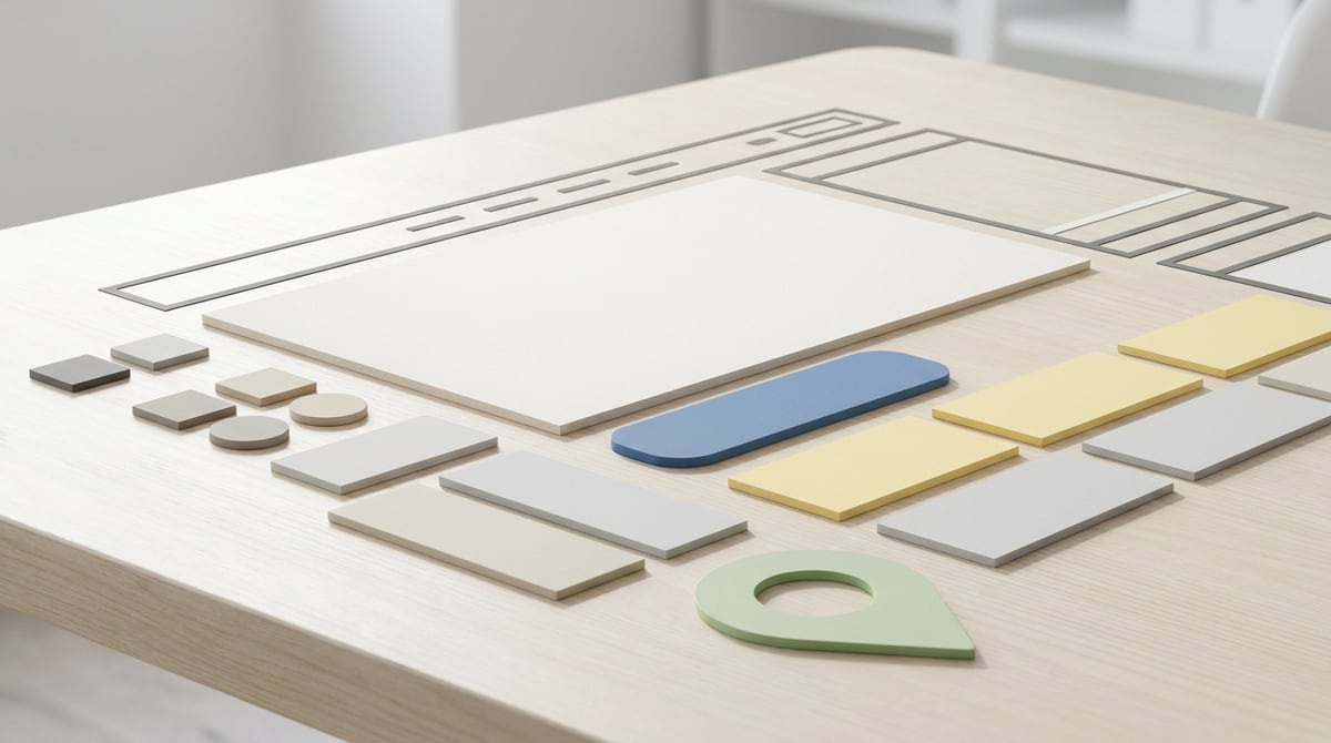
7. Use an Image That Explains the Business
The first homepage image should earn its space.
Better image choices:
- A real storefront, room, dish, treatment room, project, product, or team.
- A clear service-context image.
- A simple branded visual that supports the message.
- A website or product preview when the business sells a digital service.
Weaker image choices:
- Generic stock photos with no connection to the business.
- Dark, blurry, or cropped images.
- Decorative graphics that do not explain the offer.
- Sliders that rotate before the visitor can read anything.
- Fake interface screenshots with tiny unreadable text.
Google recommends using sharp, relevant images near related text and writing descriptive alt text. For the homepage, the image should support the main message, not compete with it.
8. Do Not Put the Whole Website Above the Fold
The first screen should orient the visitor. It should not carry every detail.
The rest of the homepage can handle:
- Service previews.
- Reviews.
- Process steps.
- FAQs.
- Pricing context.
- Team or story.
- Gallery.
- Blog links.
- Contact details.
Trying to place all of that in the first screen usually makes the homepage harder to scan. A better first screen acts like a clear doorway. It tells visitors they are in the right place and gives them a next step.
Common Homepage First-Screen Mistakes
The most common problems are practical:
- The headline is vague.
- The location is missing.
- The call to action is generic or buried.
- Navigation labels are unclear.
- The hero image is decorative but not useful.
- A popup appears before the visitor understands the page.
- The phone or booking path is hard to find on mobile.
- Trust proof appears too late.
- The first screen tries to speak to every possible customer at once.
- The layout shifts while loading.
None of these require a huge redesign to fix. Often, the first improvement is editing the headline, tightening the supporting line, choosing one primary button, and moving trust or location details higher.
How Brimky Helps With Homepages
Brimky is built for small-business owners who need a professional website without becoming the website operator.
The Brimky path starts with an industry template, then customizes the website around the business: brand, copy, services, location, contact forms, booking paths, CMS, hosting, SSL, launch support, and ongoing help. That matters for a homepage because the first screen is not just design. It is positioning, conversion, mobile usability, technical setup, and content structure working together.
If the business needs more than the base template, Brimky can scope add-ons such as extra service pages, custom pages, booking integrations, lead capture, multi-language content, analytics and conversion tracking, Google Business Profile help, managed SEO, blog posts, or custom work.
A good homepage should make the visitor feel oriented, not impressed and confused.
If your current homepage looks polished but does not clearly explain what you do, where you work, why people should trust you, and how to take the next step, start with the first screen. It is the part of the website every visitor has to pass through.
CTA
Need a clearer homepage? Browse Brimky templates or contact Brimky to plan a managed small-business website with the homepage structure, CMS, hosting, forms, and launch support handled together.